- Return to book
- Review this book
- About the author
- Introduction
- 1. Local Delicacies Project
- 2. List Views & Adapters
- 3. Navigation
- 4. Networking
- 5. Data Persistence
- 6. More Layouts & Views
- 7. Multi-factor Support
- 8. Performance
- 9. Services
- 10. Resources
- 11. Epilogue
- 12. About The Author
- 13. Bibliography
Tablet Design
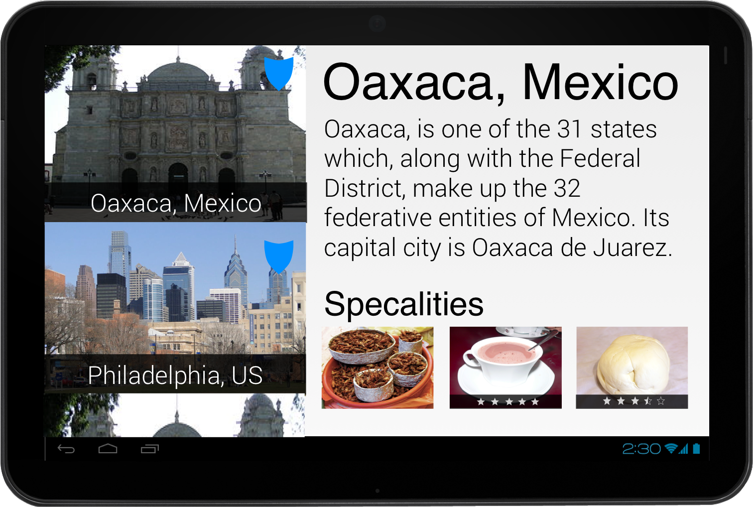
The tablet design is similar to the phone, but combines several view elements into one.
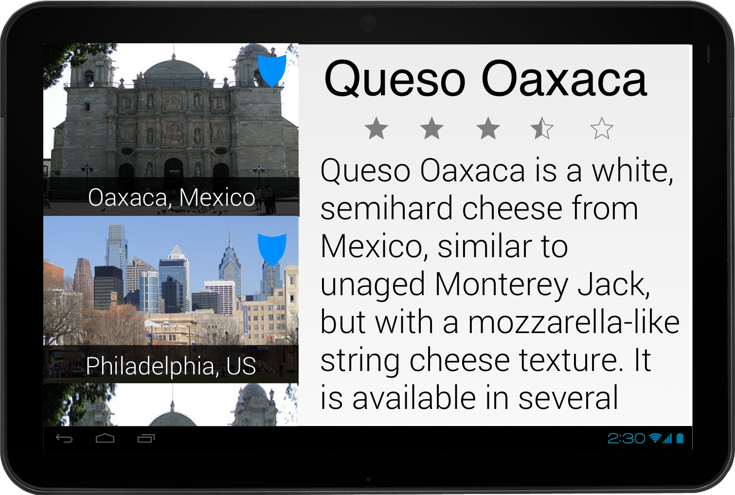
We still show a list of locations and delicacies, but this list is always shown on the left-hand side of the application. When we select an item, it updates the view on the right to show the details for that location.

The location detail has the same information, but it is arranged differently. The specialties will be shown as a collection of CoverView's (see lab on custom views for more detail) at the bottom of the location detail.
Notice that we are no longer using a
ViewPagerto show more information about a location and it's delicacies.

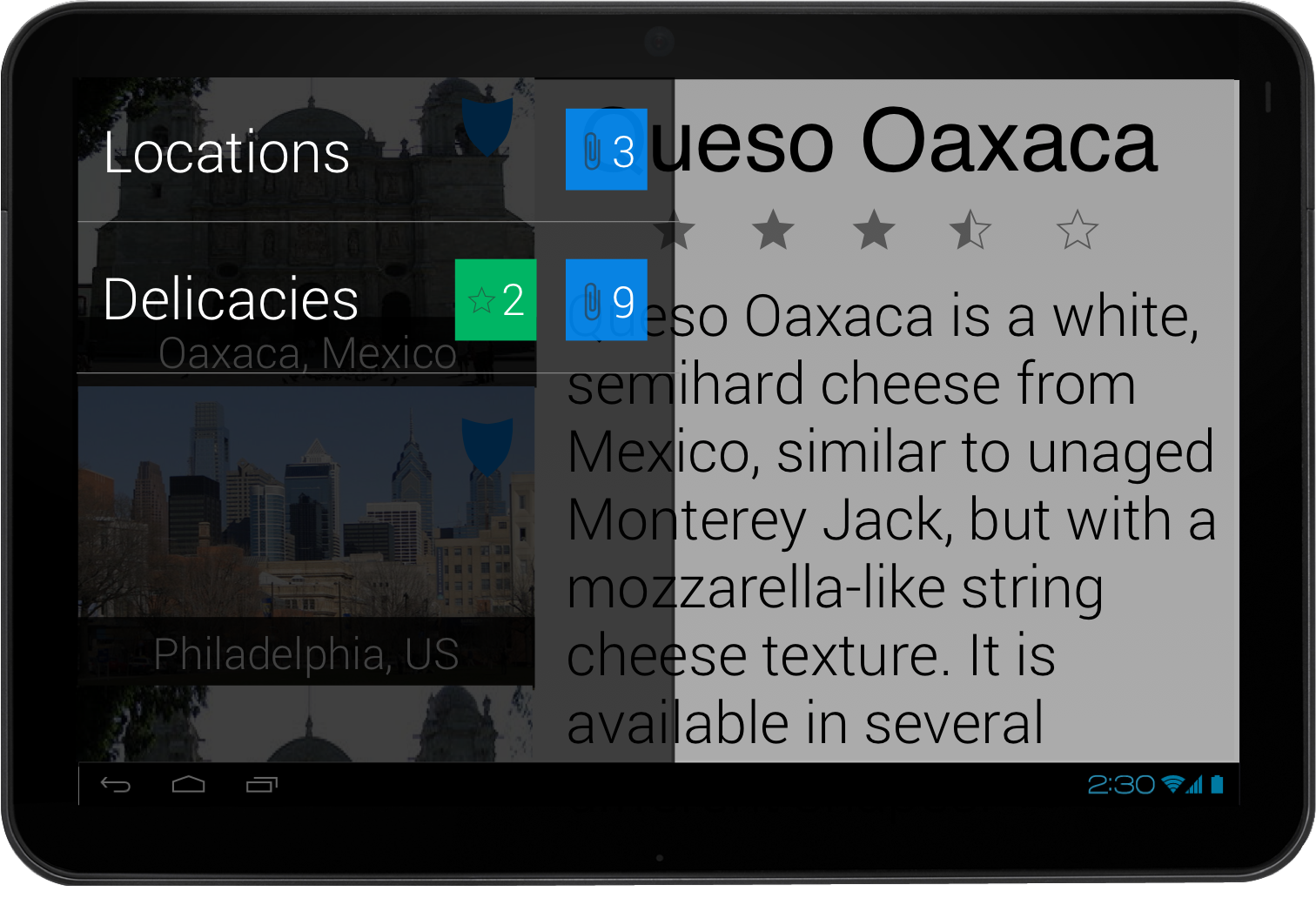
We will use the same navigation elements navigation drawer and ActionBar (not pictured).
