- Return to book
- Review this book
- About the author
- Introduction
- 1. Local Delicacies Project
- 2. List Views & Adapters
- 3. Navigation
- 4. Networking
- 5. Data Persistence
- 6. More Layouts & Views
- 7. Multi-factor Support
- 8. Performance
- 9. Services
- 10. Resources
- 11. Epilogue
- 12. About The Author
- 13. Bibliography
Lab: UI Optimization
Let's analyze our application.
Overdraw
Run the app with the overdraw setting to see the overdraws for the application on your phone. Here's what mine looked like:
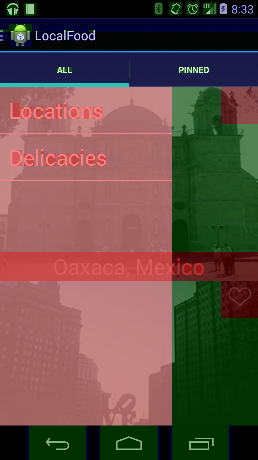
Dark red is the worst, then red, blue, and then green. If you aren't overdrawing a section it will show as transparent (no color overlay).
Next, let's take a look at the hierarchy view for the application.
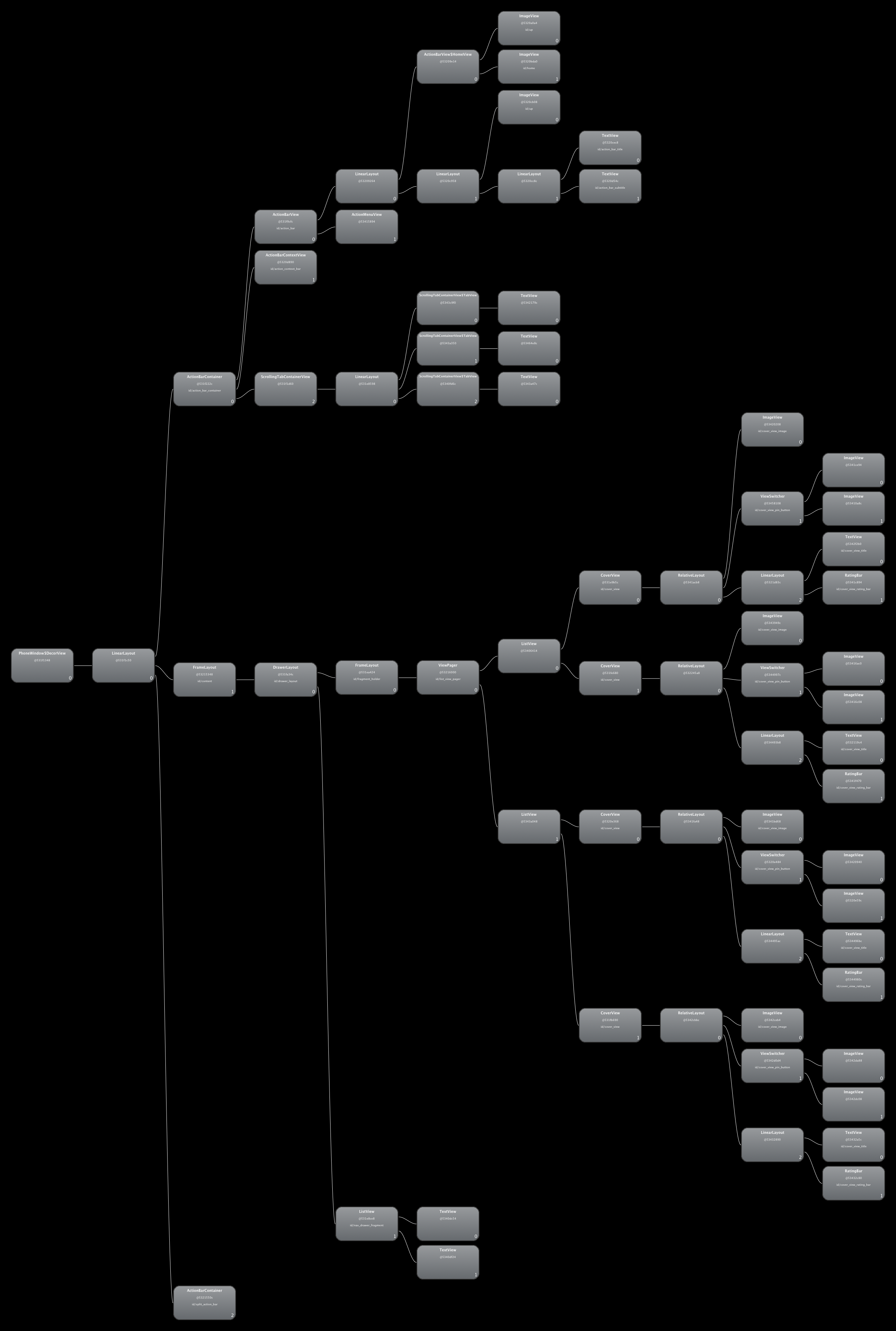
You can click around to different views to see very detailed information about each view element.
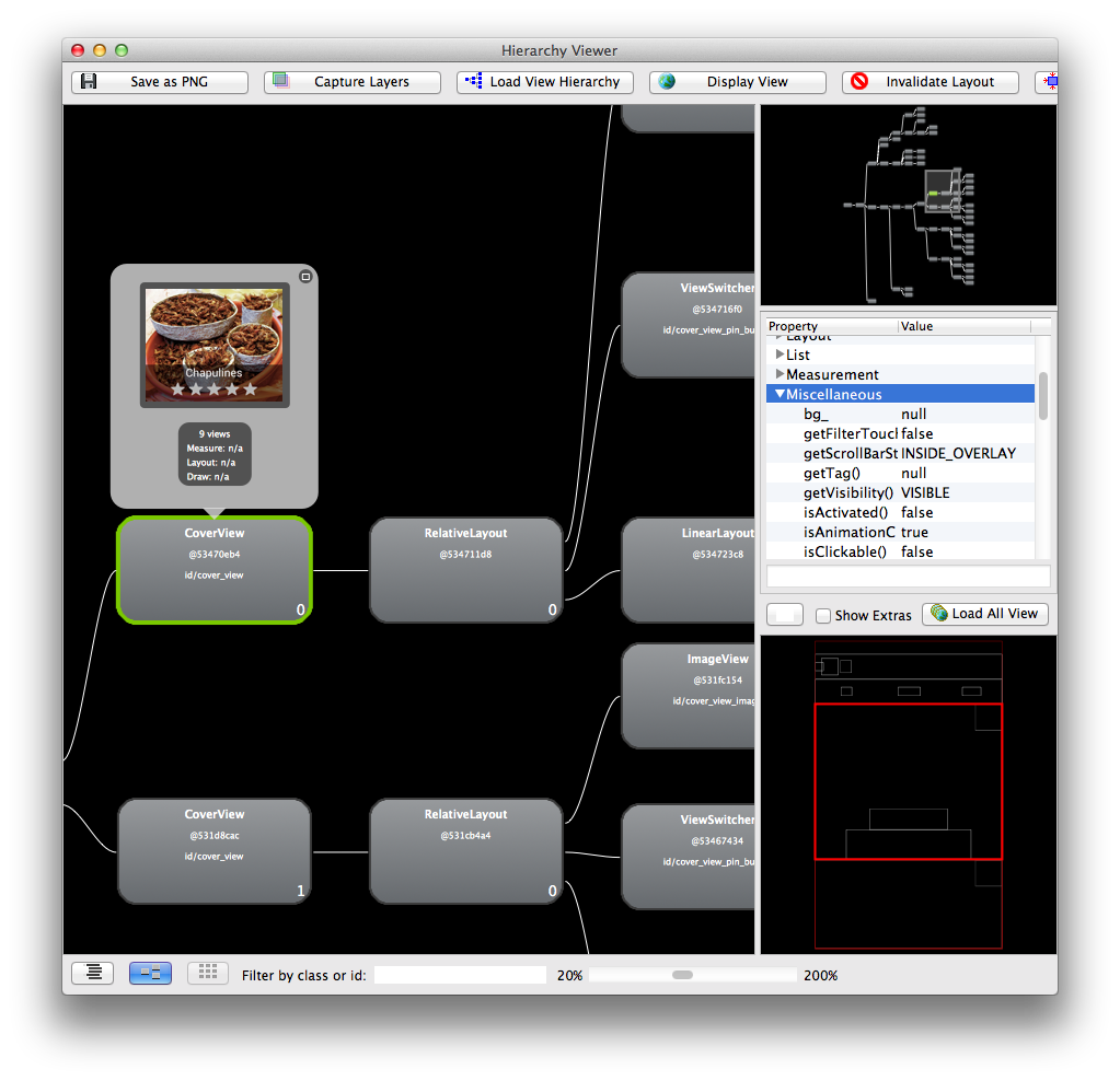
Notice our lonely RelativeLayout in the view hierarchy for the CoverView. CoverView extends a RelativeLayout, so this layout is useless, which is also pointed to by the fact that it has no other children. If we use the <merge/> tag instead of using a RelativeLayout as your base for the XML view.
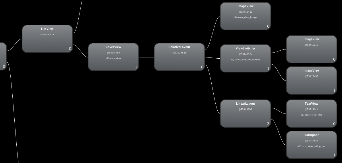
Another cause for concern is this long line of views. I have a fragment that has a view pager that has 1-2 list views in it. Since the data is basically the same across all of these list views (the other two lists are just subsets of the original list), this could be significantly reduced. Some of this just takes a simple <merge/>, others take a bit of rethinking the application view structure.
