- Return to book
- Review this book
- About the author
- Introduction
- 1. Android
- 2. TDD with Robolectric
- 3. Architecture
- 4. Fundamentals
- 5. Resource System
- 6. Managing the Lifecycle
- 7. Lab: Calculator
- 8. Appendix
- 9. Epilogue
- 10. About The Author
- 11. Bibliography
Solution: Design Chunking
Part 1: Google Music
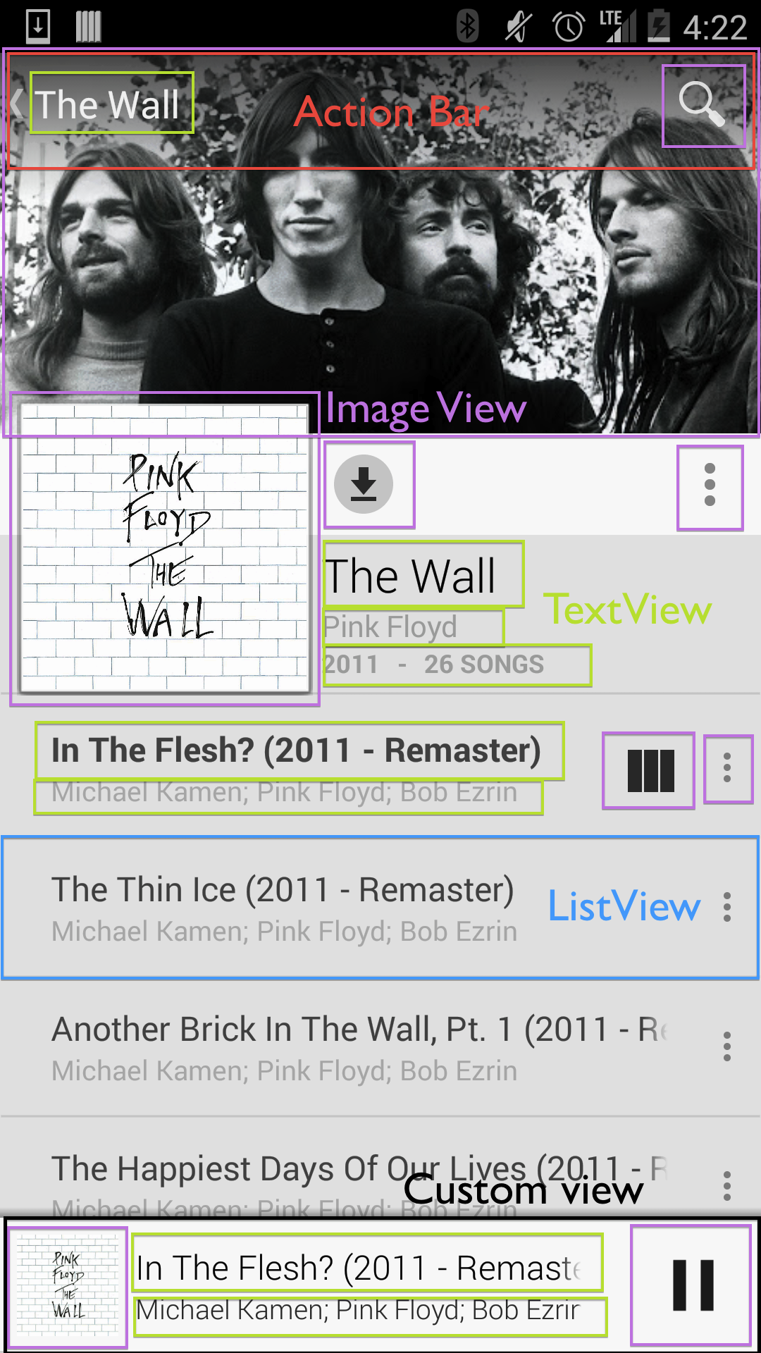
They use ActionBar (transparent), with a title of the album and one icon (search).

The action bar overlays an ImageView for the artist. Below that is an image of the album we're viewing. To the right of the album is album information displayed in TextView's and several options available just to the right of the album cover (either Button's or ImageView's). This is likely a RelativeLayout since things are laid out relative to other items on the screen.
Under the album info is the list of songs for this album in a ListView. Each list view item is fairly simple collection of TextView's and an ImageView for album options. There's an ImageView that shows on a row only if the song is currently playing.
Note: When scrolling down in the list of songs, the album and artist information is pushed off the screen so that you can focus on the most relevant information. This would be a custom implementation to add this behavior.
At the very bottom of the screen, there is a custom view that allows you to play/pause the current song or open the full song view that has a host of other options.
Note: This view is persistent throughout the application even if you browse other albums.
Part 2: Twitter
There's a lot going on in this design!
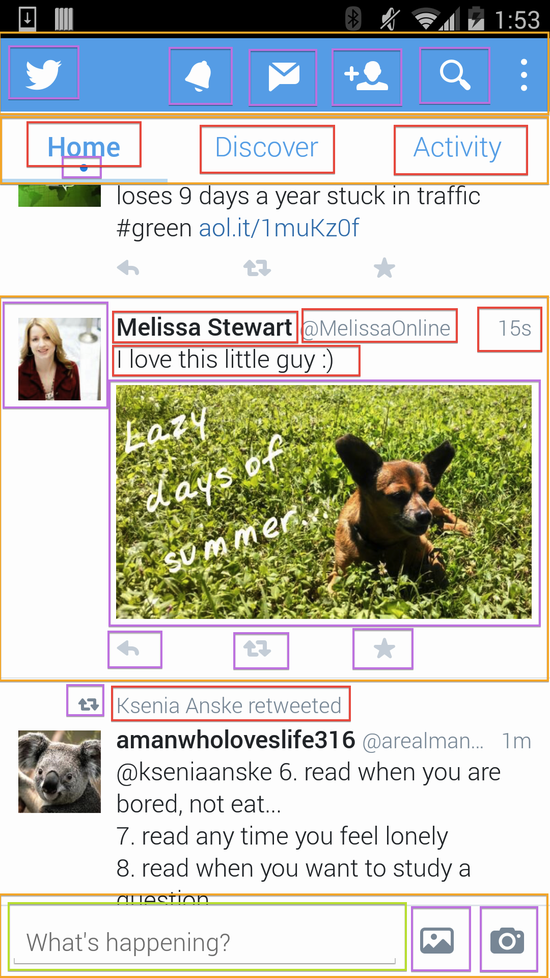
Twitter also uses an action bar with icons, no title, and an overflow menu. They use a tab controller just below the action bar for the different tweet streams, which has a indicator for the current tab.

Your tweet stream is displayed in a ListView. Each tweet is has several pieces of data, such as text views and images that represent retweets, authors, time since posting, etc.
At the bottom of the screen, they have a custom view that combines two buttons for posting images and an EditText (custom implementation) for entering a new tweet.
Clicking on most options takes you to another activity.
Part 3: Calculator
There are many valid ways to break down a design. Each choice has consequences or benefits when we build out the application.

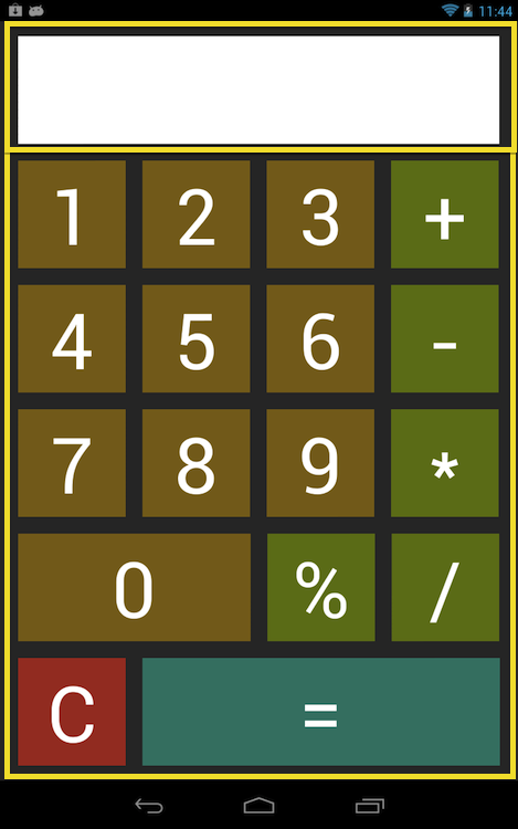
In our class implementation, we'll be using two Fragments laid out in a LinearLayout with android:orientation="vertical".
The DisplayFragment will handle the display. We'll use an EditText to display the numbers entered into the calculator as well as calculations.
The ButtonFragment will contain and control the calculator buttons. We'll use a RelativeLayout to position many Button's for operations and numbers.
Discussion Questions
- What was your design? How does it differ?
- How do you think that will impact implementation?