- Return to book
- Review this book
- About the author
- Introduction
- 1. Android
- 2. TDD with Robolectric
- 3. Architecture
- 4. Fundamentals
- 5. Resource System
- 6. Managing the Lifecycle
- 7. Lab: Calculator
- 8. Appendix
- 9. Epilogue
- 10. About The Author
- 11. Bibliography
Lab: View Styles
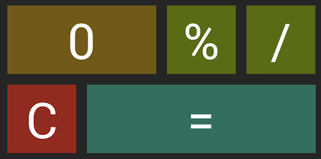
Let's make our calculator look nice! By the end of this lab we will create and apply styles to all of our buttons. We'll also create a style for the display.

Color Scheme
- Number button: #876D13 (Brown)
- Operator button: #668113 (Green)
- Equals button: #268474 (Blue)
- Clear button: #B0281A (Red)
Create styles
First, create a file called styles.xml in res/values/. This is where all of our styles and themes live in the application.
Base button
If you analyze the design, you'll notice that the buttons are basically variations on a theme. The only variants in the style are different colors and some buttons are wider than others. Since these buttons are so similar, it makes sense to create a basic style that each button type will inherit.
Let's add this base button style to styles.xml.
<style name="BaseButton">
    <item name="android:layout_width">@dimen/button_dimensions</item>
    <item name="android:layout_height">@dimen/button_dimensions</item>
    <item name="android:layout_margin">@dimen/button_margin</item>
    <item name="android:textSize">@dimen/key_text_size</item>
    <item name="android:textColor">@android:color/white</item>
</style>
Here we've specified the height and widths of the view, the margin between the buttons, the color of the text, and the size of the font. All but the last use abstracted dimen's. We'll add these in the next section. For the final item (text color), we use an Android supplied color instead of creating our own.
Create dimensions
Now it's time to start using dimensions!
Start by creating the dimens.xml file in res/values/. Then add the base line values for the view. We'll add different versions of this file in a later lab to scale to different screen sizes.
<resources>
    <dimen name="button_margin">5dp</dimen>
    <dimen name="button_dimensions">60dp</dimen>
    <dimen name="key_text_size">30sp</dimen>
</resources>
Number style
Now that we have BaseButton and all the dimensions needed to make it a reality, let's use it to create our Number style.
You can inherit attributes from parent styles and add your own configurations for the newly derived style.
<!--Number-->
<style name="Number" parent="BaseButton">
    <item name="android:background">@color/brown</item>
</style>
For now we'll set the background to a flat color. In a later lab we'll extend this style to provide visual feedback upon user interaction.
Note: You can also inherit from multiple styles: http://developer.android.com/guide/topics/ui/themes.html#Inheritance
Create colors
Let's add colors to colors.xml for the new buttons. The Number color brown is shown below:
<color name="brown">#876D13</color>
Remove extra attributes
Another benefit of creating styles is that it will clean up our XML files. Remove any attribute that is covered by the style. Here's the updated 1 key:
<!--1-->
<Button
    android:id="@+id/key1"
    android:text="@string/key1"
    style="@style/Number"/>
Much cleaner! I move as much as possible to styles to keep my XML files lean. I generally leave attributes the source XML file that relate to positioning in the view (e.g. RelativeLayout positioning), text for a button or text view, and the id.
Operators, Equals, and Zero
Using the information above, create and use styles for each of these key types. When you finish, the view should look like the screenshot.
Display
Finally, clean up the display view in display.xml using a style.